lee wee & brothers
A Taste of The Good Ol’ Days
Manic and Lee Wee & Brothers got together, and we are happy to announce the birth of our love child.
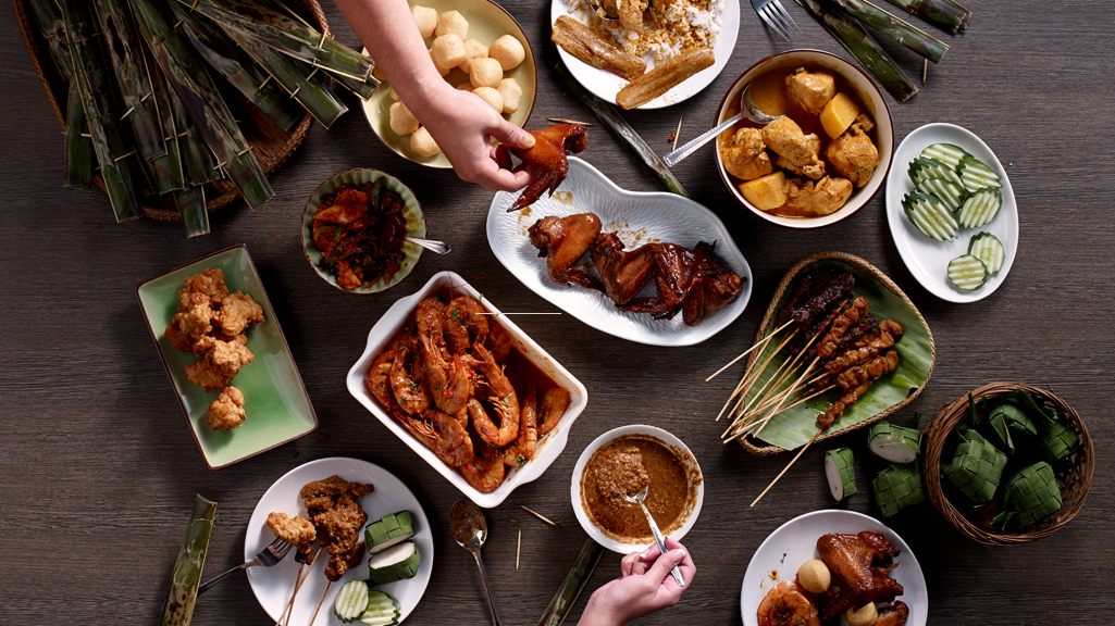
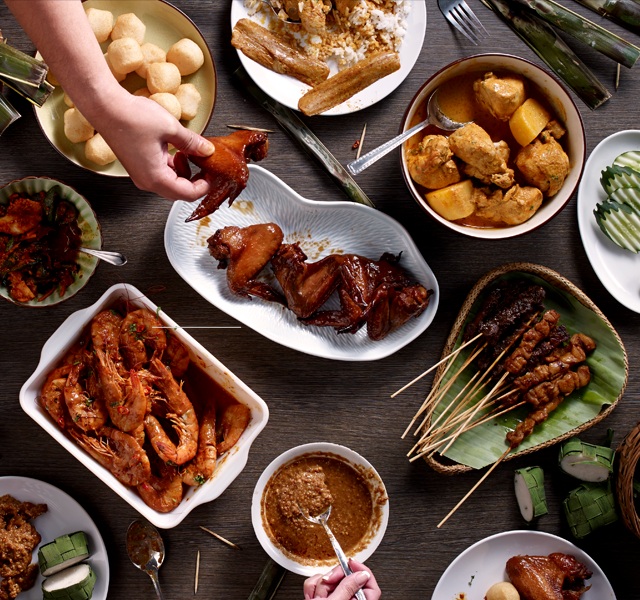
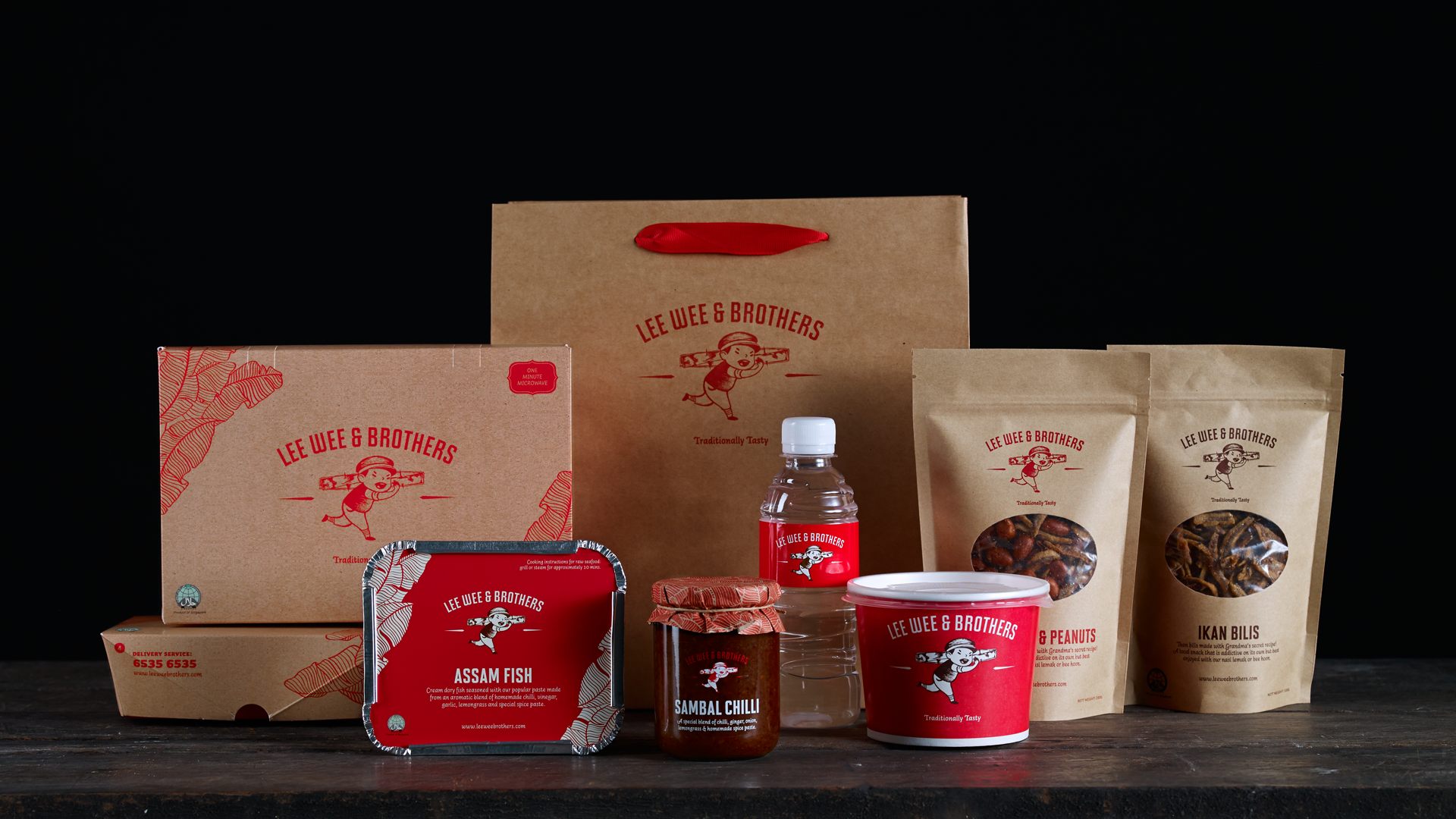
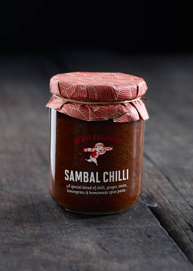
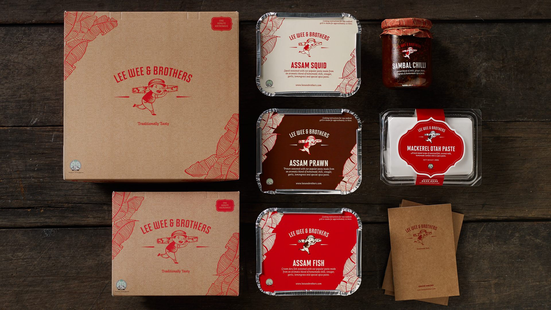
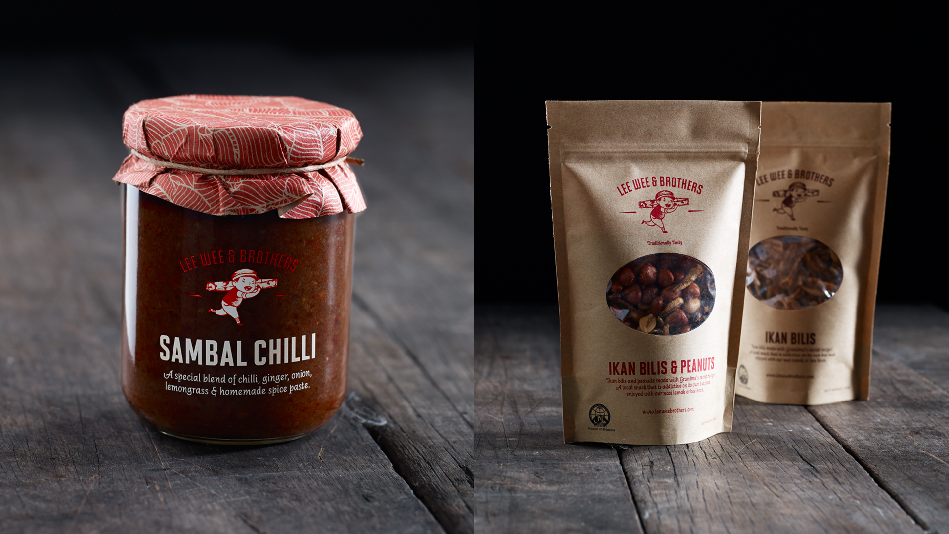
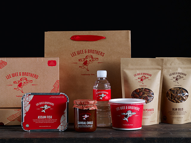
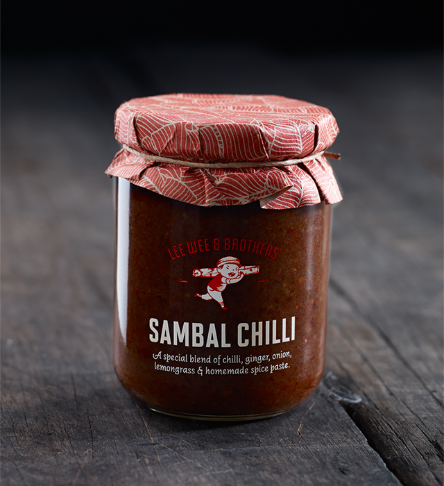
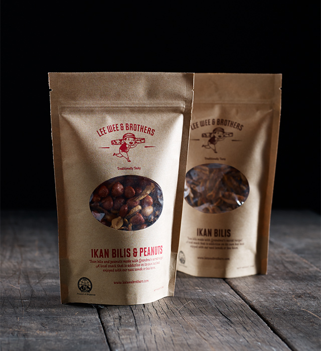
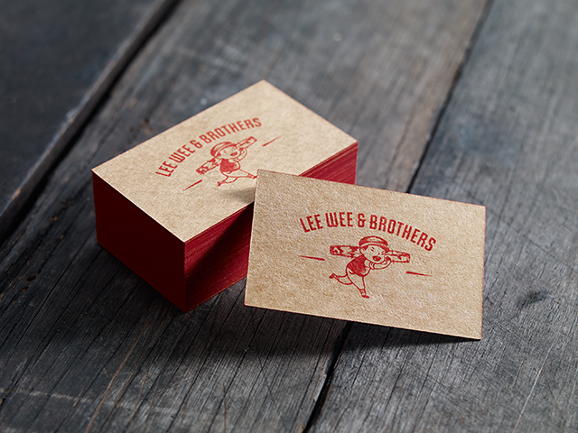
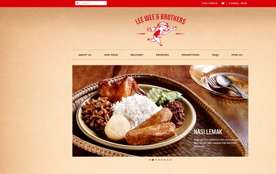
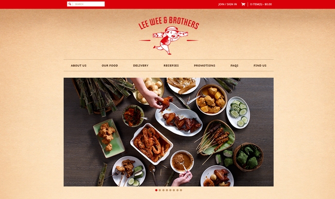
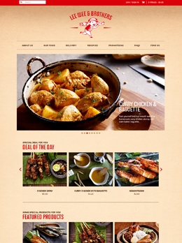
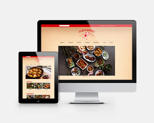
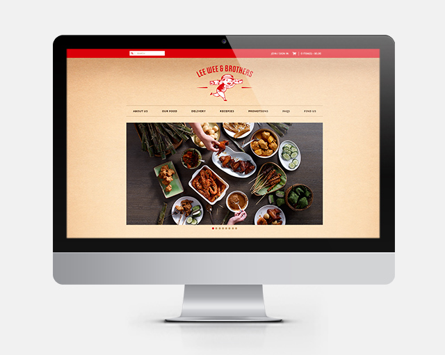
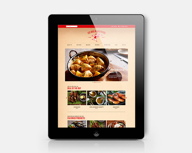
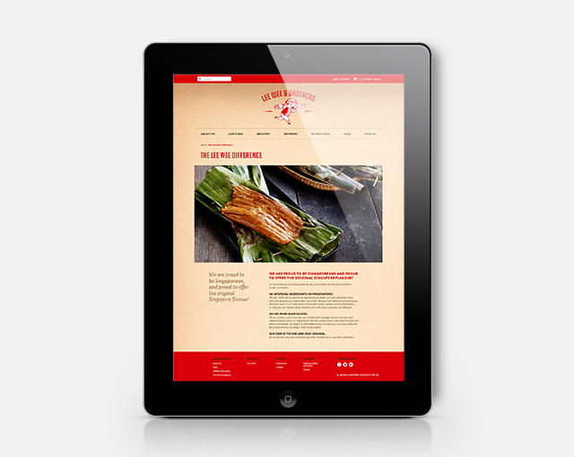
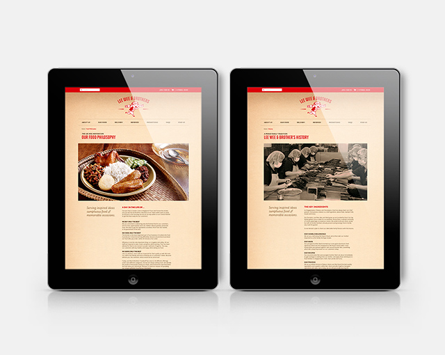
A local household brand synonymous with otah (or otak-otak), Lee Wee & Brothers takes pride in a family-run business philosophy that emphasizes traditional recipes and methods. When they saw the need to refresh their brand and revamp their online store, they tasked us with the job of completely redesigning their logo, packaging, shop design, website, collaterals and other touchpoints. We also art directed and styled the photography of all their key dishes, presenting their food as much more than just simple hawker fare.
Lee Wee & Brothers
Re-inventing a Heritage Brand
There is a particular joy - and challenge - of working with a heritage brand that is not found in a project for a corporate brand. Stakeholders are often family members with strong ideas of how the brand should be portrayed, and many are often resistant to change. Fortunately we found the right balance on this project and arrived at a solution that straddles both tradition and contemporary design in a simple, uncluttered style.
