Store and Brand Revitalisation
National Healthcare Group
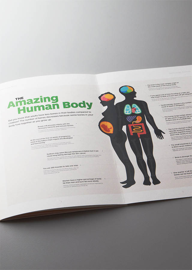
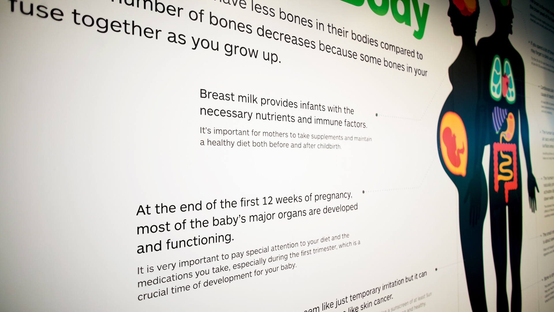
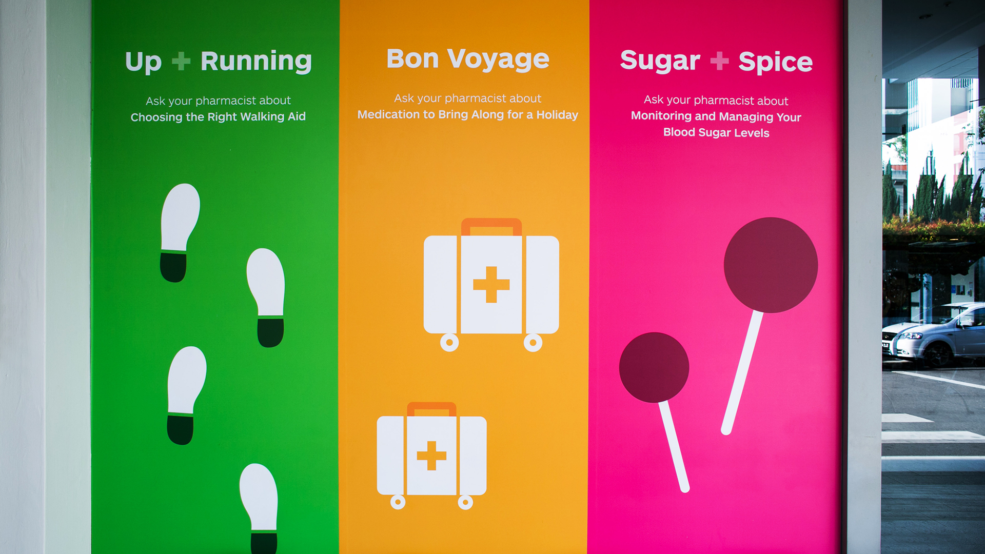
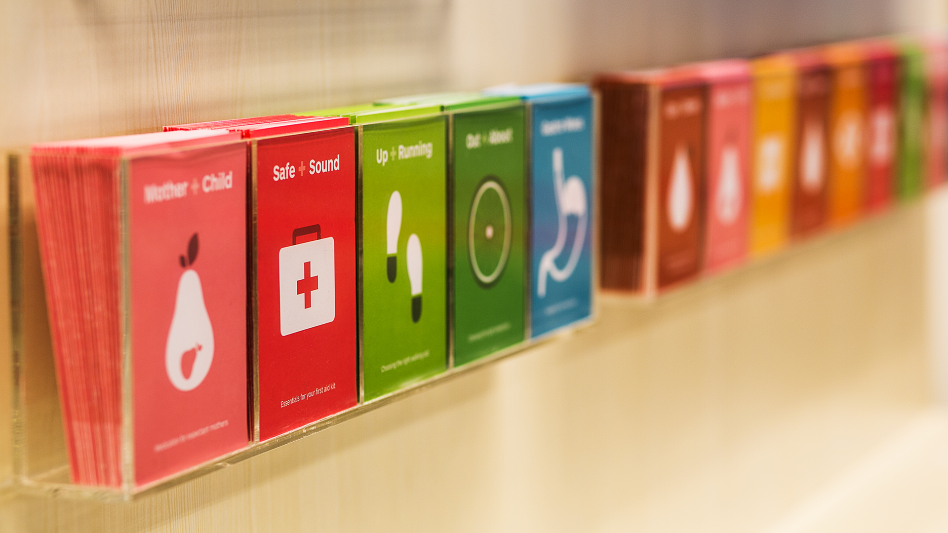
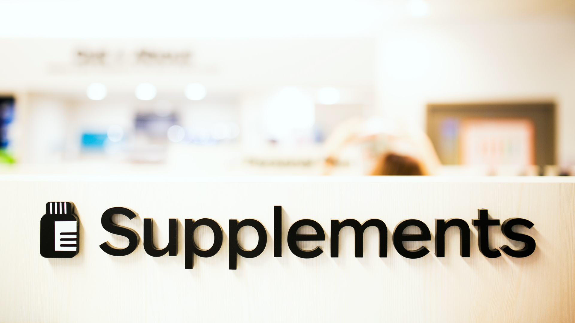
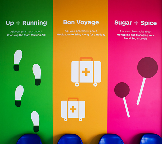
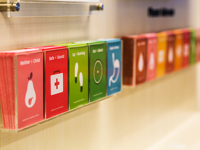
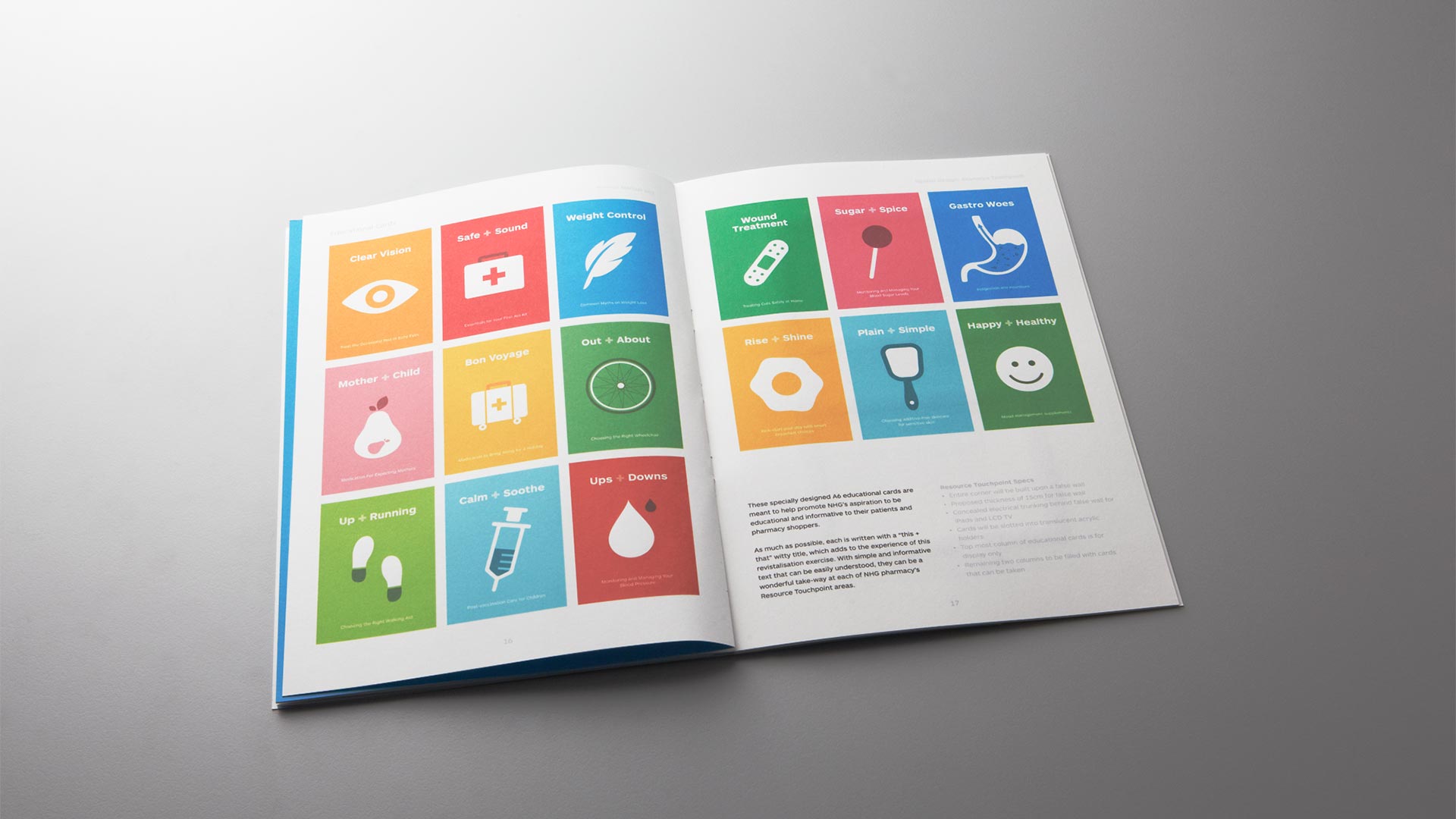
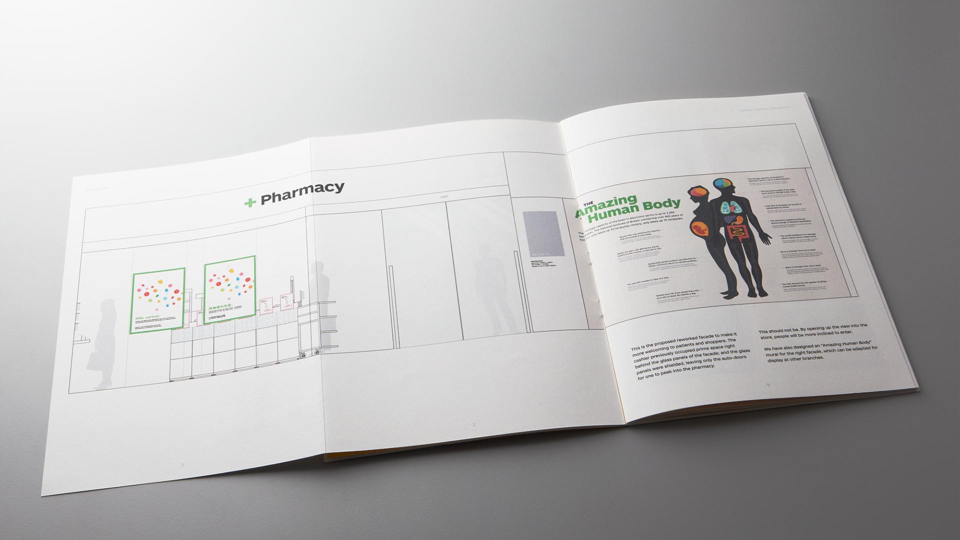
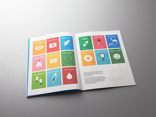
The National Healthcare Group appointed Manic for a store revitalisation and design project for their chain of pharmacies across the island. We worked with a retail category management specialist and came up with a complete redesign of the stores' layout and design, including new signage, retail displays and materials. We also enhanced the customer experience by introducing touch screens, posters and educational post cards. The end result was a pharmacy that not only looked clean and comtemporary, but also provided customers with a more informed and pleasant shopping experience.
National Healthcare Group
Happy + Healthy
The National Healthcare Group appointed Manic for a store revitalisation and design project for their chain of pharmacies across the island.
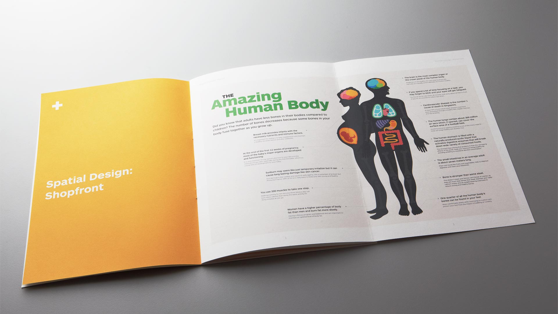
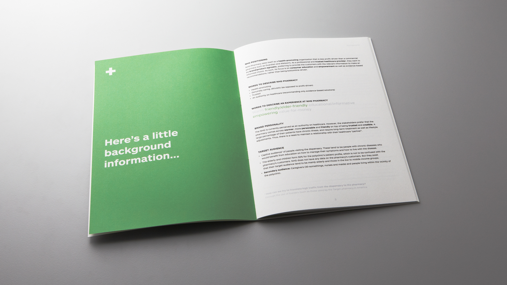
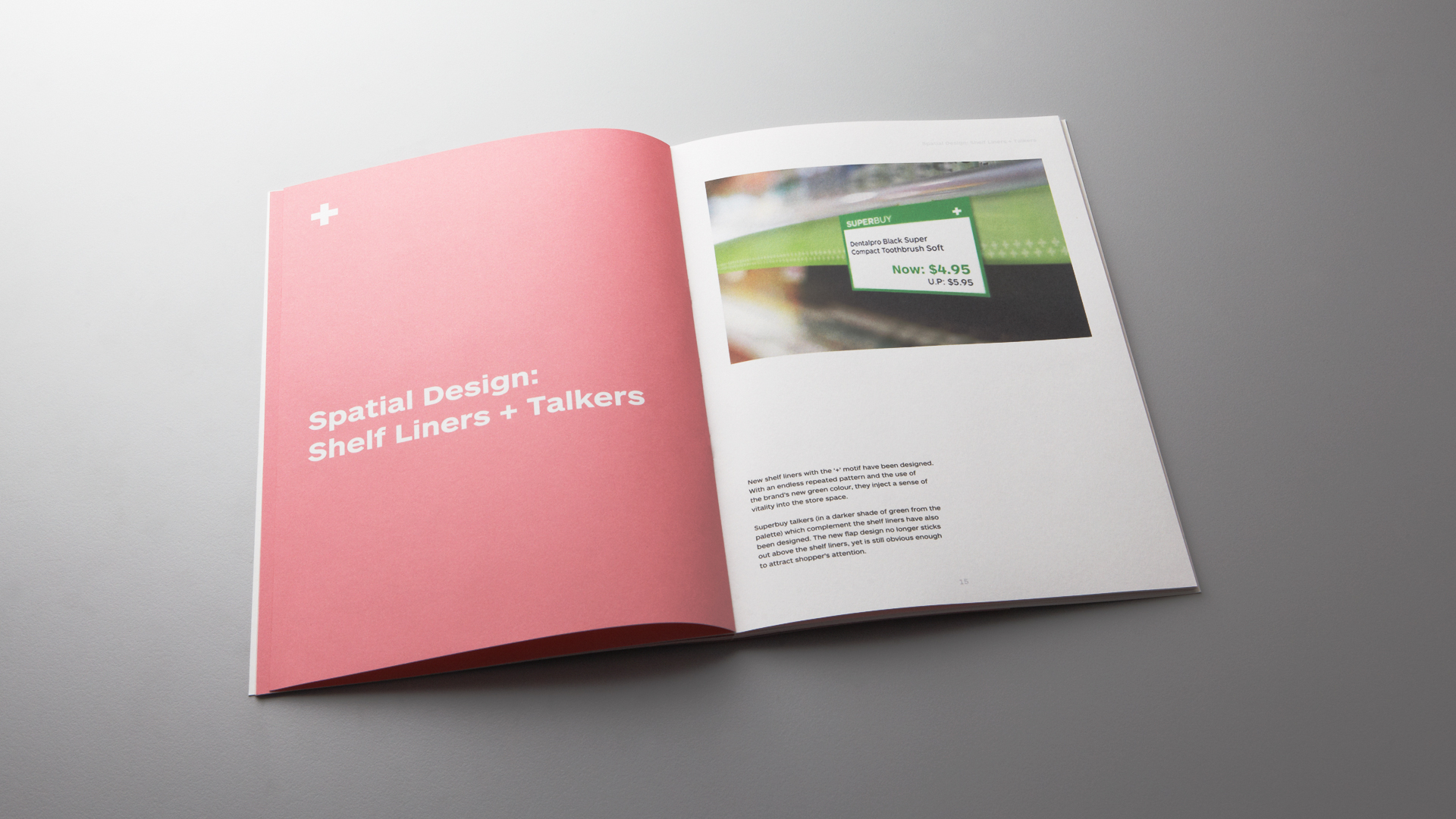
We worked with a retail category management specialist and came up with a complete redesign of the stores’ layout and design, including new signage, retail displays and materials. We also enhanced the customer experience by introducing touch screens, posters and educational post cards. The end result was a pharmacy that not only looked clean and contemporary, but also provided customers with a more informed and pleasant shopping experience. We suggested ways to engage patients and improve the experience at the pharmacies and compile our recommendations in a manual so that when time comes to refurbish a store or create a new one, it is easy to maintain consistency.

National Healthcare Group
Consistency is Key
#Brand Guidelines
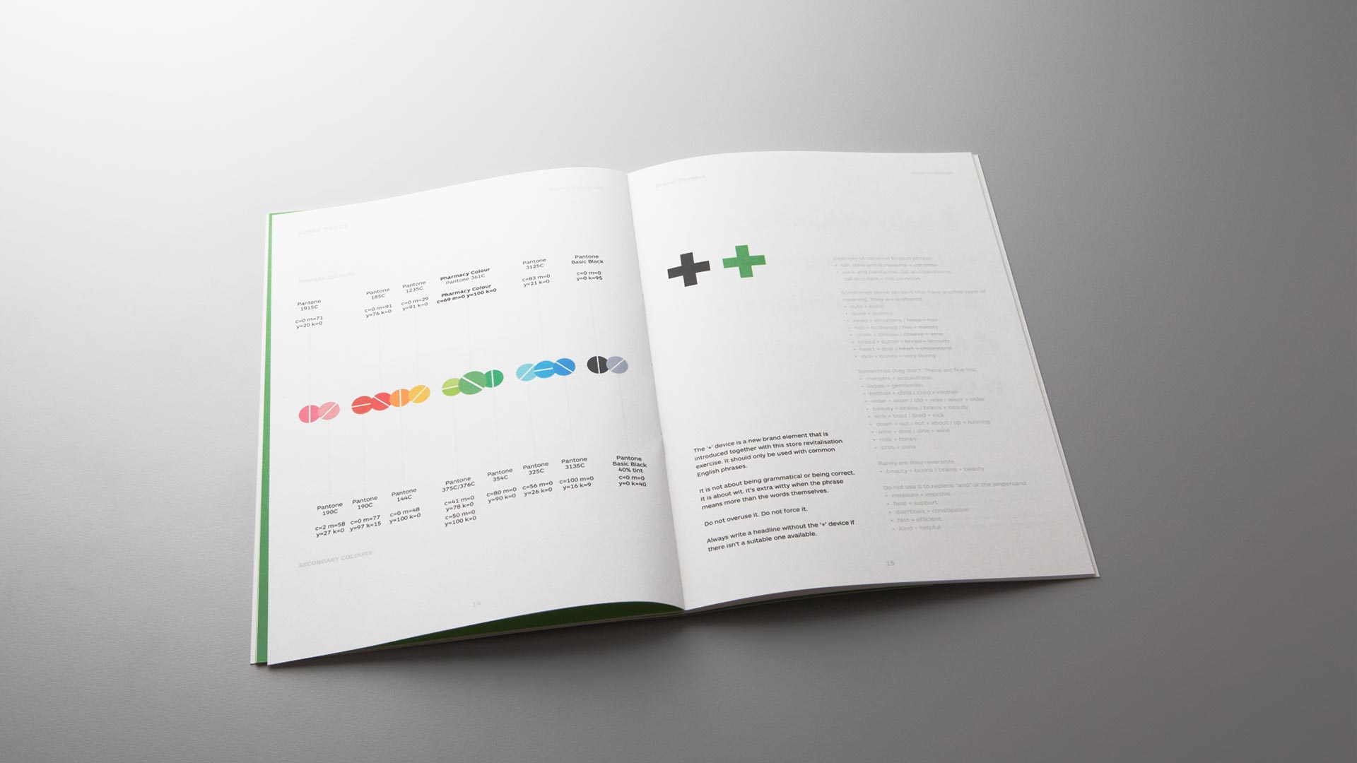
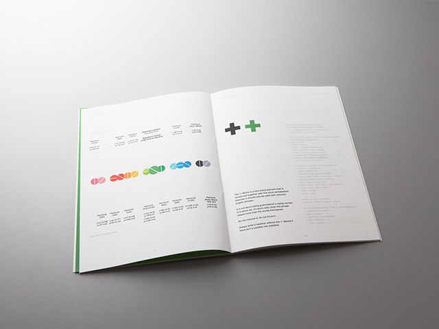
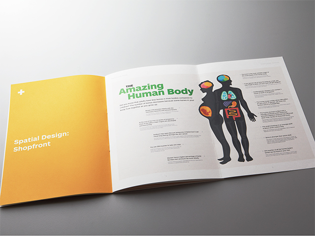
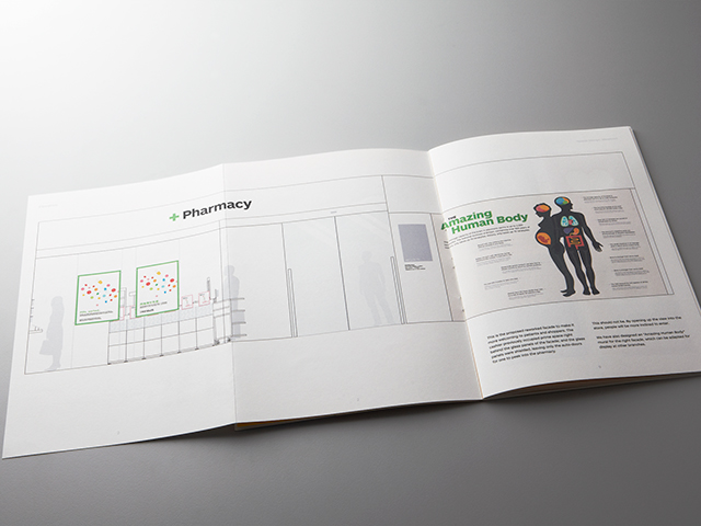
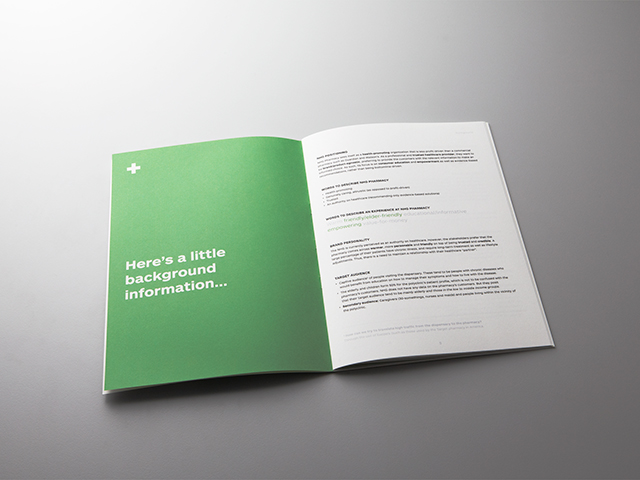
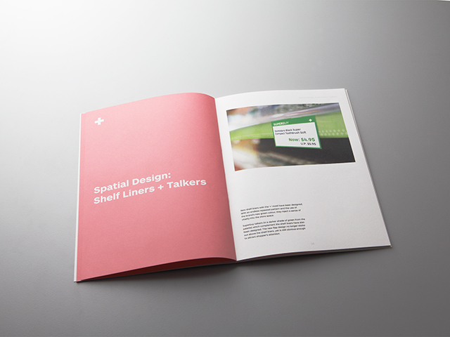
Without any guidelines, the old pharmacies took on disparate looks over time. We created a brand manual to help the client keep all their branches consistent, covering everything from graphic design, to spatial design, lighting, construction and materials. Each pharmacy has a different layout and retail mix, so the most important objective of the manual was to guide the adaptation of the design intent to each space.
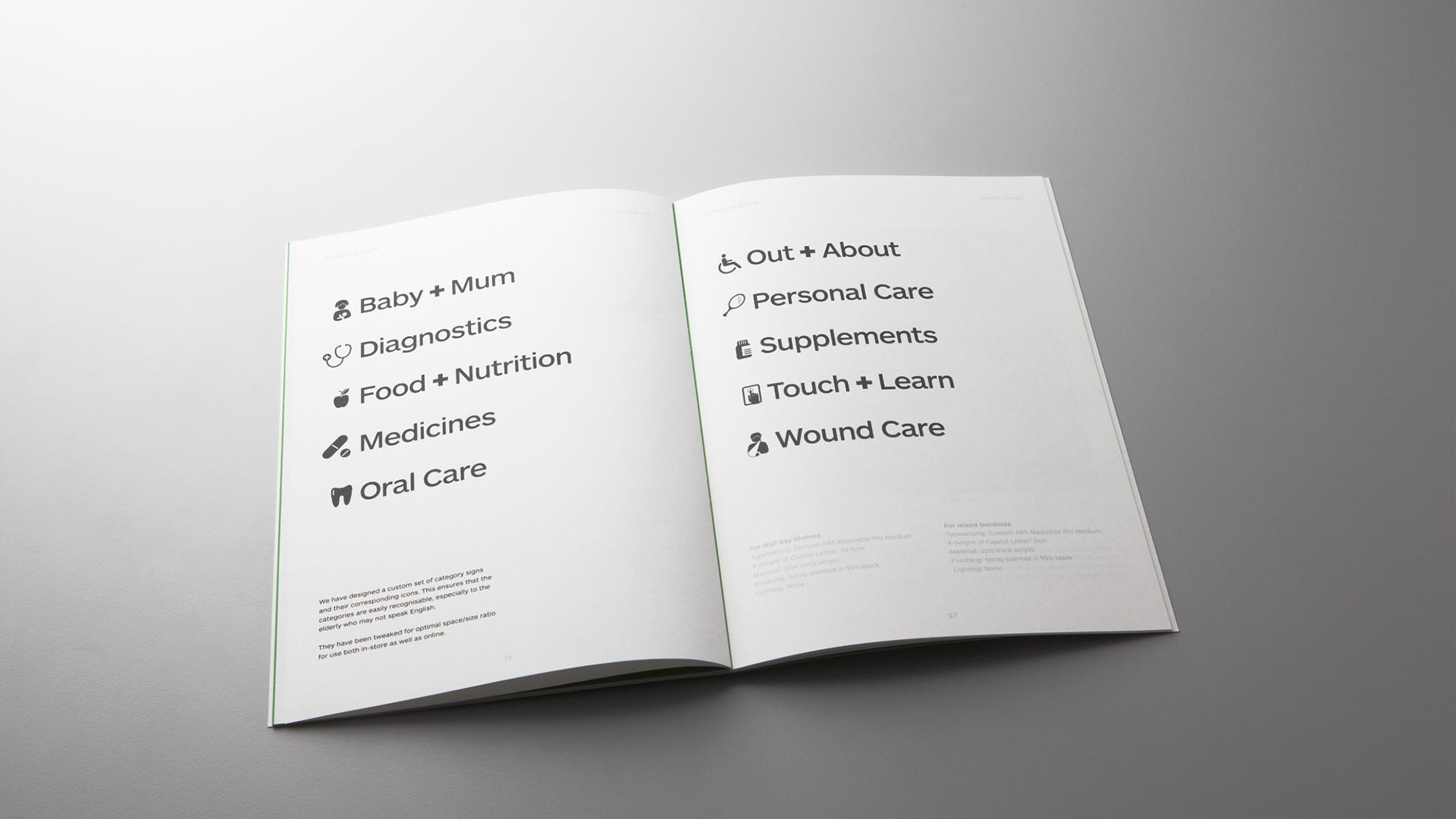
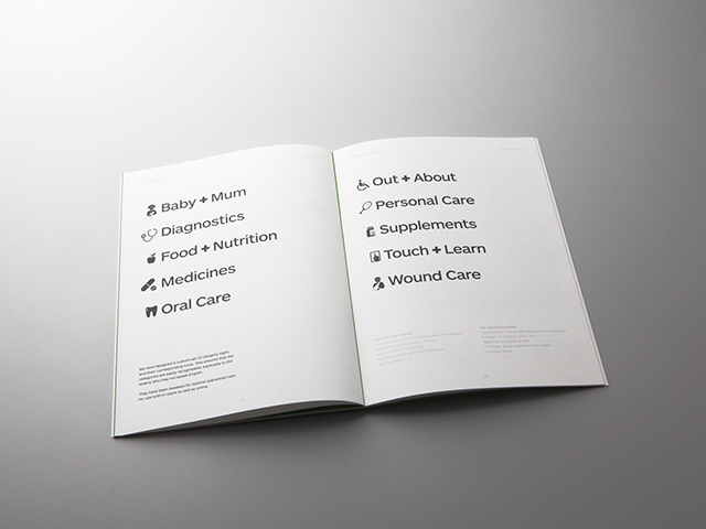
Icon Design
Plain + Simple
